Updated 03-Aug-2025
See also discussion of WebP
Note I no longer use OSX but instead Debian 9 Linux, and therefore have switched to the Trimage image compressor GUI which works well much of the time. When it doesn't I resort to ImageMagick.
A recent post from one of my favorite blogs, the Tips-and-Tricks-HQ people spurred this response. They discussed various image optimization schemes being promulgated by and offered for WordPress.
Well, the big challenge with all of this image optimization is that it is too complex by needing more stuff on the server, increases the number of images (both to manage, and to ship to clients when they resize/orient their browsers/devices). That is actually not a good thing, and it is also wholly unnecessary.
In the blog post the "original image" which was supposed to be 498kb is actually 27kb in size (perhaps your server "optimization" automatically modified the image you wanted to display? Yes, another piece of the complexity which actually reduces the amount of control over what your site will provide visitors).
However, I put the image through JPEGmini + ImageOptim + JPEGmini + ImageOptim and reduced the image to 13kb. That is twice as efficient as whatever automated system is being used.
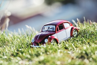
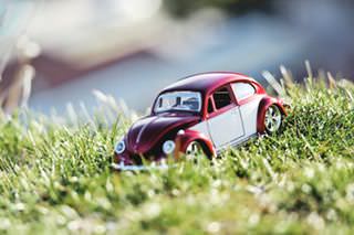
Which of the these images is 50% smaller in size? Hint there are two that are larger and two that are smaller. Even if you see a difference, is it a meaningful difference to the reader? Find out which are which through View Source or Inspect.
The point I am making is manifold:
- No complex server-side optimization need be used, because there are tools that can be used by anyone to optimize images previous to upload.
- Automated server-side optimization provides less control over images, not more.
- Automated server-side optimization is less efficient.
- A proliferation of image sizes (again, server-side optimization) will increase images, therefore increase bandwidth as well as number of objects to manage (and get out of sync), and also slow down the site if a given client/browser is resizing/re-orienting the site.
In sum, less server-side is more efficient and more effective.
Reader Feedback
On 03 May 2016, a reader sent me a comment on this post, as follows:
> You said not to use server-side optimization, but rather to optimize before you upload to WP. > > But isn't there one problem in that approach: WP resizes your images (large, medium, thumbnail) and those won't be optimized? > > If you always upload the exact and only size you intend to use, then it's of course not a problem, but that means you can never change your theme or CSS to use bigger images (or use retina ones, if you weren't already). To me, a long-term solution would be to upload the original full-sized images always. > > Whenever I read about optimizing images before uploading, no one seems to address this problem. Am I missing something?
My Response
Thanks for your email. You have valid points.
I avoid using WordPress image management tools altogether and don't upload or edit with that. Maybe I'm losing out on the auto-compression and the auto-resizing, but these can easily be done with ImageMagick or other command-line tools (as that is what WordPress uses in any case).
That said, using bigger images in the future is certainly a possibility, and I should have mentioned that original images should also be saved along with optimized ones, so that one can redo them (in an automated or manual way) in the future, as needed.
The problem with relying on WordPress is that it is not likely that the sizes they picked for automation are going to be what you need in the future. So yes, upload originals, but no, avoid the WordPress web-based tool/management system.
Another suggestion is to always target image sizes that will be fairly robust for the future. While we can't know the future, one thing is for sure, the human brain and visual system is not likely to change soon. Things like optimal text line length are built in and while your video screen can become huge (and also can be moved further from our noses) the fact remains that there is an optimal reading text column length. Make images that fit that same width, or 40-60% of that width. For retina just upsize by a factor of 2 (or more). For the sidebar, the same 40-60% of that width will work. And so, we have some fairly robust image widths (in terms of human perception on a website that has some amount of text in paragraphs).
And finally, there are additional file-types that should be considered. Apparently Webp is making progress, and then there is svg native files. Some level of automation is still possible, such as conversion of jpg, png, gif to webp on-the-fly and detecting Chrome browsers and sending webp images.
See also discussion of WebP